Venetian Red | Matisse Acrylic Paint
Chemical Description: Synthetic iron oxide
Pigment Number: PR101
Lightfastness Rating: ASTM I
Pigment Opacity: Semi-transparent
Paint Opacity: Semi-transparent
Series 2
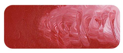
Venetian Red | Matisse Acrylic Paint
Venetian Red is a pure iron oxide with real wow factor. It gets its name because the natural iron oxide deposits inland from Venice were this color which was midway between the deeper violet iron oxides found near Pozzuoli and the common red oxides found elsewhere. It has the unusual property of having a relatively warm mass tone and a comparatively cool undertone and this makes it perfect for making pinks of great character. Because it is not quite so opaque as the standard Red Oxide the undertone gets a chance to really shine. The Venetian painters used this color with flair and particularly as a result of Titian’s usage of it, it became a famous color throughout Italy. There is a pit outside Venice that claims to be the same one that Titian used to source his pigment. They still dig and sell the pigment in small quantities but the deposits are too small for any large scale production. Instead industrial production has moved to other sources in the Venice region. because of the variability in quality that is inevitable with natural ochre production, most artist paint manufacturers now use the synthetic version which is more reliable and a more pure red than the natural oxides. It is one of the most permanent colors on the palette and retains its permanence even in the lightest tints. Incidentally this same dark red iron oxide was given various names at different times and in different places but essentially the traditional names such as English red and Indian red represent colors in this same color range and the names are virtually interchangeable, however the Venetian Red name appears to be older and has always been associated with the very finest grades of the pigment.
This same shade of red oxide is found in the stone age cave paintings in France and when discovered they were clearly as vibrant as the day they were painted 16,000 years earlier, Admittedly they were in complete darkness which helps a great deal as light can degrade colors over time, even the most permanent ones, but light is only one of many causes of instability in colors. Moisture in the air and chemical reactions with other substances in close proximity can work to change colors over time, especially with stone age paints which lack the protection a modern acrylic film gives to the pigment by insulating it from its environment. Despite such a huge amount of time nothing was able to degrade the red oxide colors and today we can be certain that what we see is unchanged from what the original artists painted on the wall all those thousands of years ago.
Another thing that hasn’t changed is the usefulness of this color to the artist. Despite all the wonderful bright colors that have become available over the years, Venetian Red retains a special place on the palette. It is like an earthy version of Brilliant Alizarine as its hue could be considered just a more subdued version of that color. Thus it can be used in very similar mixing situations but with some important distinctions. The mixtures it makes always have a softer, a more muted character than a similar mixture using Brilliant Alizarine. Pinks made with Venetian Red work well in depicting flesh tones because of their softness. Like its organic cousin it can make violets and mauves but when using Venetian Red it is easy to get dusky sorts of mauves and pinks that really look like the pinks commonly found in nature. These sort of colors can have great subtlety and beauty and because they are automatically muted they work in well with other colors and are helpful when building harmonies. The relative opacity of the color also makes a difference. Where Brilliant Alizarine finds it easy to make transparent glazing colors, Venetian Red is proud of its strength and covering power. Thus Venetian Red is complimentary to Brilliant Alizarine. Not in the sense that they are opposite each other in the color wheel, but because the qualities of one works like a brother with the other and the advantages of one complements the advantages of the other. When an artist uses this color they find it easy to understand why Titian loved the color so much and why, despite a lack of variety of color choices, those stone age artists could make art of such incredible beauty.
Safety Data Sheet for Matisse Venetian Red (SDS)
To view or download a copy of Venetian Red SDS, please CLICK HERE * (271kb)
*The above link will open an external Dropbox window

To install this Web App in your iPhone/iPad press ![]() and then Add to Home Screen.
and then Add to Home Screen.
