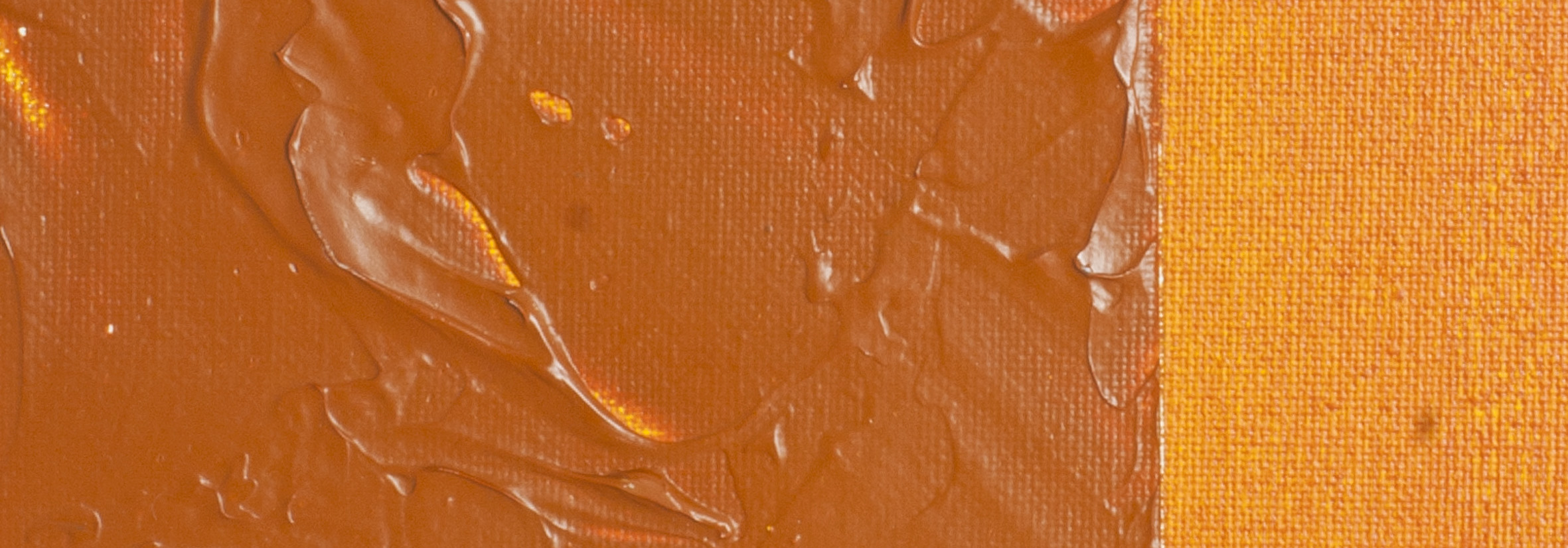
Transparent Venetian Red | Matisse Acrylic Paint
Chemical Description: Benzimidazolone
Pigment Number: PBr25
Lightfastness Rating: ASTM I
Pigment Opacity: Transparent
Paint Opacity: Transparent
Series 3
Transparent Venetian Red | Matisse Acrylic Paint
Both Transparent Venetian Red and Permanent Maroon work well with Venetian red to depict deep earthy reds moving in and out of light and shadow. In the old master way of doing things shadows were always dark and transparent while lights were opaque and the mid tone transition into the dark was often a scumbled mixing of the two using the texture of the canvas to produce the transitional color. Scumbling is where a wet color (usually lighter) is dragged back over a dry area and the area where the brush runs out of paint and the underneath color shows through the upper layer is called scumbling. Scumble works best where there is a definite texture to catch the paint being applied over the background. For an example of how this works we can imagine a small canvas which is depicting the folds in a piece of fabric with a strong side light. The entire area is painted using Transparent Venetian Red to which a small portion of Venetian Red is added in order to ensure the colors are knitted together but not so much as to significantly reduce transparency nor darkness. This layer of paint is allowed to dry. Now use Venetian Red to create the mid tone which gets scumbled back into the darker area and Use Ash Pink to lighten the Venetian Red to get the lightest tones. This description specifies Venetian Red but works just as well when using Transparent Venetian Red or other transparent dark underneath other colors too.
Although both Transparent Venetian Red and Permanent Maroon can be used for this technique, Transparent Venetian Red has the advantage of being a much more affordable color. Such practical considerations are important when making color choices in the shop. There are times when the more expensive pigment must be used because of particular qualities unique to that color so it is nice to be able save some money in situations where the exact color difference is not so important. It should be noted that the cost of individual pigments is less to do with their relative quality and more to do with the cost of manufacture. Some pigments have more expensive raw materials or have more time consuming or difficult steps in the manufacturing process.
Another way to use Transparent Venetian Red that is very effective is to mix it with Iridescent Medium MM24 or use Iridescent White when lightening the color. The richness of this reddish brown and its transparency make for beautiful iridescent effects which can be handy when depicting metal. A variation on this technique is to mix Transparent Venetian Red with any of the Matisse metallic colors such as Metallic Bronze, Metallic Copper, or Metallic Gold depending on the exact metallic color you are trying to achieve. Transparent Venetian Red works well for the darker areas of metal. It is a versatile color which works just as well as a dark red, as a dark earth color and as a metallic for a start without mentioning other possibilities such as mixing with Ultramarine Blue for deep luminous violets. These sort of colors only became available to the artist is comparatively recent times yet once an artist uses it it becomes difficult to imagine how we ever made do without such colors in the past.
Safety Data Sheet for Matisse Transparent Venetian Red (SDS)
To view or download a copy of Transparent Venetian Red SDS, please
CLICK HERE
* (271kb)
*The above link will open an external Dropbox window

To install this Web App in your iPhone/iPad press ![]() and then Add to Home Screen.
and then Add to Home Screen.
