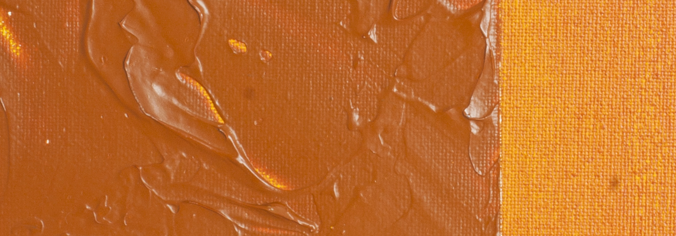
Prussian Blue | Matisse Acrylic Paint
However, this commitment to authenticity comes with its own set of challenges. Prussian blue pigment is notoriously unstable in water-based systems. Over the years, we've dedicated countless hours to research and experimentation to stabilise it as much as possible. Despite our best efforts, the pigment tends to become slightly jelly-like after a few years, especially in hotter climates. This is why our Prussian Blue is one of the few colours we make with a use-by date.
In our pursuit of authenticity, we refrain from adding other colours to our Prussian Blue to standardise the colour. This means that the colour can vary slightly between batches of pigment. However, this variation is a small price to pay for the purity of the stain.
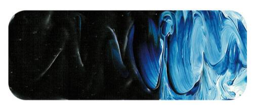
Matisse Prussian Blue: A "Wow Factor" Colour
Matisse Prussian Blue is a real "wow factor" kind of colour. All acrylic ranges in the early days of acrylics had Phthalo Blue as the standard dark blue colour because Prussian Blue was very sensitive to the alkaline environment of wet acrylic paint and was very unstable. Prussian Blue was an industry standard, but there had been little development work done on the colour for over a hundred years, and that didn't matter to those who made it because the paint was still selling well.
Prussian Blue in the New Century: Revival and Innovation
Fast forward to a new century, and Prussian Blue was showing its age. There were more and more applications for which the old colour was no longer suitable, and production was falling. To save the industry, chemists started developing new varieties of colour capable of withstanding the conditions in modern plastics and paints. These new variants were of high quality and suffered from none of the bad habits of poorly made Prussian Blue of the past century. Matisse experimented over a long period with the new varieties of the colour, and Matisse Prussian Blue is the result of this exhaustive testing.
The Historical Importance of Prussian Blue
Prussian Blue is historically significant. It was the first synthetic pigment developed in the modern era. Its popularity even spread to the Orient, and we often associate the beautiful dark blue with Japanese prints, primarily Prussian. Hokusai's most famous work, the famous Great Wave Of Kanagawa print, is an example. Back in Europe, artists invented new colours such as Hookers Green by mixing Prussian Blue with Gamboge and generally enjoying the creative freedom the new blue allowed.
Comparing Prussian Blue with Other Blues
Prussian Blue is similar to Phthalo Blue in that both are intense and very strong colours. Prussian Blue differs because it is a denser mineral colour and, therefore, has more body when painting.
Colour Mixing with Prussian Blue
Prussian Blue is a versatile pigment that plays a vital role in colour mixing, offering a wide range of possibilities:
Dark Greens: Prussian Blue is ideal for creating rich dark greens. Try mixing Prussian Blue with Transparent Yellow Oxide for deep, moody greens. Or Cadmium Yellow Light or Nickel Titanate are excellent choices for cleaner greens, while earth colours can create the more olive types of garden often found in nature.
Blacks: By blending Prussian Blue with other dark shades, you can achieve deep blacks that add depth and intensity to your artwork.
Violets: Prussian Blue can be used to create exciting violets. Mix it with Matisse Rose Madder or Magenta Quin Violet for dark purples. Combine Prussian Blue with Permanent Light Violet and a touch of Australian Red Violet for lighter mauves. Adding Venetian Red into these mixtures can yield beautiful results for softer, more natural violets.
By understanding the properties of Prussian Blue and experimenting with different combinations, artists can unlock a broad spectrum of colours, from vibrant greens and purples to subtle earth tones. Its adaptability and unique characteristics make Prussian Blue essential to any artist's palette.
Safety Data Sheet for Matisse Prussian Blue (SDS)
To view or download a copy of Prussian Blue SDS, please
CLICK HERE
* (271kb)
*The above link will open an external Dropbox window
Prussian Blue is available in Matisse Structure, Matisse Flow
.
Prussian Blue | Matisse Acrylic Paint
Chemical Description: Ferric amonium ferrocyanide
Pigment Number: PB27
Lightfastness Rating: ASTM II
Pigment Opacity: Transparent
Paint Opacity: Semi-transparent
Series 1

To install this Web App in your iPhone/iPad press ![]() and then Add to Home Screen.
and then Add to Home Screen.
