Primary Red | Matisse Acrylic Paint
Chemical Description: Quinacridone
Pigment Number: PV19
Lightfastness Rating: ASTM I
Pigment Opacity: Semi-transparent
Paint Opacity: Semi-transparent
Series 4
Primary Red | Matisse Acrylic Paint
Understanding the Basics of Colour Theory
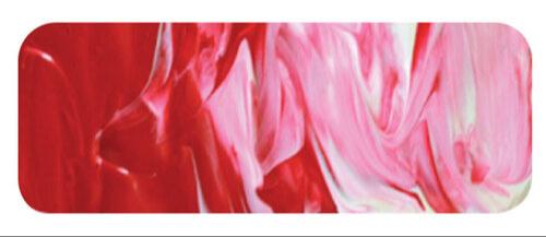
Let's delve into the fascinating world of colours, where the magic happens with just a handful of primary hues, black, and white. Theoretically, any colour can be concocted from these essentials, excluding white in watercolour-like techniques, as the paper plays the role of white. Yet, the real-world limitations of pigments pose challenges in reproducing certain shades through this minimalistic palette. Nonetheless, sticking to the three primaries, along with black and white, provides a broader spectrum of mixed colours compared to any other five on the palette, proving the versatility of primary colours in various artistic scenarios.
Teaching Colour Theory: Simplifying the Basics
Educators can impart the essence of colour theory through engaging demonstrations. These practical sessions offer insight into the creation of secondary and tertiary colours. Traditional mixing of paints before application is one method, but there's a fascinating alternative – the pointillist approach. Imagine applying paint as countless tiny dots, allowing them to visually blend in the eye. This technique mirrors the four-color printing process used in books and magazines, where primary colours, akin to those by Matisse, bring illustrations to life.
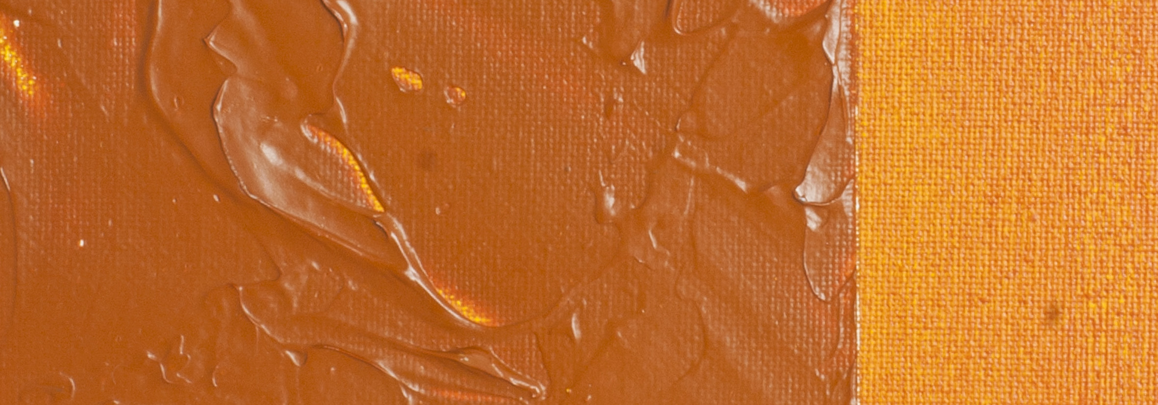
The Power of Matisse Structure Primary Red
Enter Matisse Structure Primary Red, a vibrant hue strategically placed in the red spectrum. This clean, bright red proves its flexibility by effortlessly blending into a vast array of colours. Crafted from a quinacridone pigment, originally designated as PV19 due to its violet shade, it evolved into the brilliant red we know today. The pigment's success extends beyond the artistic realm, finding applications in various industries. Interestingly, a close relative, Pigment Red 122, is recognized for its stunning magenta appearance in artists' paint.
Quinacridone Pigments: Artists' Favourites
Artists favor quinacridone pigments for their purity and mostly transparent nature, often a desirable trait. For Primary Red, a departure from transparency was necessary, leading Matisse to select a captivating semi-transparent version of PV19. This decision highlights the meticulous choices artists make to achieve the perfect balance in their palette.
Safety Data Sheet for Matisse Primary Red (SDS)
To view or download a copy of Primary Red SDS, please CLICK HERE * (271kb)
*The above link will open an external Dropbox window

To install this Web App in your iPhone/iPad press ![]() and then Add to Home Screen.
and then Add to Home Screen.
