Permanent Maroon | Matisse Acrylic Paint
Chemical Description: Perylene
Pigment Number: PR179
Lightfastness Rating: ASTM I
Pigment Opacity: Semi-transparent
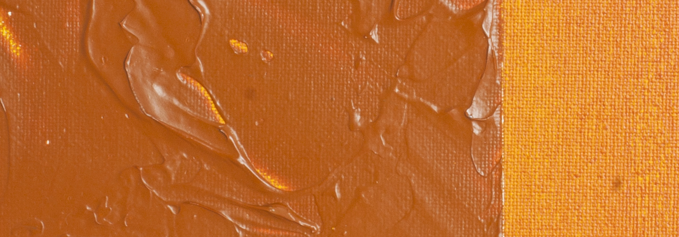
Paint Opacity: Opaque
Series 6
Permanent Maroon | Matisse Acrylic Paint
Perylene Molecules: A Chemical Symphony
Chemically identified as Perylene Maroon, Pigment Red 179 is a result of the unique arrangement of two naphthalene molecules, forming a distinct "peri" arrangement. This molecular structure contributes to the pigment's remarkable stability, making it resistant to light. Beyond its role in art, Perylene Maroon finds application in research, particularly in the development of photovoltaic cells and LED lighting.
Artistic Frustration: The Maroon Dilemma
While boasting desirable qualities such as permanence, non-toxicity, chemical resistance, and compatibility with various painting media, Pigment Red 179 poses a challenge for manufacturers. The frustration lies in its deep maroon hue, diverging from the popular preference for bright and vibrant reds. Yet, for artists seeking depth and richness in colour, this unique maroon proves ideal.
Earthy Colours' Legacy: A Centuries-Old Palette Tradition
Throughout history, earthy colours have held paramount importance on artists' palettes. Common pigments in every region, readily available reds and yellows have been staples. The familiarity and usefulness of these earthy tones obscured certain limitations, with pigment development primarily focused on the brighter realms of yellow, red, violet, blue, and green. Notable exceptions, like synthetic iron oxides in the mid-19th century, enhanced the reliability of earth colours, making even less common shades accessible.
Transformation in Colour Dynamics: A Shift Since the Late 20th Century
The late 20th century marked a transformative period. Transparent iron oxides entered the scene, and paint manufacturers began exploring high-performance organic pigments. Initially, colours like Transparent Venetian Red and Permanent Maroon were categorized with brighter reds. However, their true value emerged when viewed as additions to the earth colour range. Unlike their vibrant counterparts, these subdued colours exhibited earth-like behaviour when mixed.
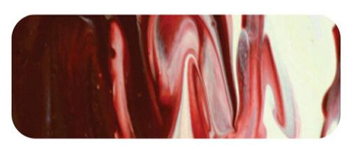
Permanent Maroon's Transparency: A Creative Marvel
Permanent Maroon introduces a glorious transparency, a departure from the traditionally opaque nature of earth colours. While opacity serves its purpose, the inclusion of transparent options amplifies creative possibilities exponentially. Suited for watercolour-like techniques and ideal for glazing, this rich deep red shines best in undertones. It excels in shadowing brighter reds, adding depth to fabric folds. Combining with Venetian Red enriches the colour, while pairing with Cobalt Blue yields warm violets. Mixed with Yellow Oxide or Nickel Titanate, it produces a spectrum of golden earthy hues and subdued oranges—a palette reminiscent of Vincent Van Gogh's preferences. Despite being a slightly pricier option among earthy colours, the artist is rewarded with a canvas of beautiful and nuanced mixtures.
Safety Data Sheet for Matisse Permanent Maroon (SDS)
To view or download a copy of Permanent Maroon SDS, please CLICK HERE * (271kb)
*The above link will open an external Dropbox window

To install this Web App in your iPhone/iPad press ![]() and then Add to Home Screen.
and then Add to Home Screen.
