Matisse Indigo | Matisse acrylic paint
Chemical Description: Indanthrone
Pigment Numbers: PB60
Lightfastness Rating: ASTM I
Pigment Opacity: Transparent
Paint Opacity: Semi-Transparent
Series 6
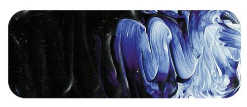
Matisse Indigo | Matisse acrylic paint
Understanding the Origins: The Anthraquinone Mystery
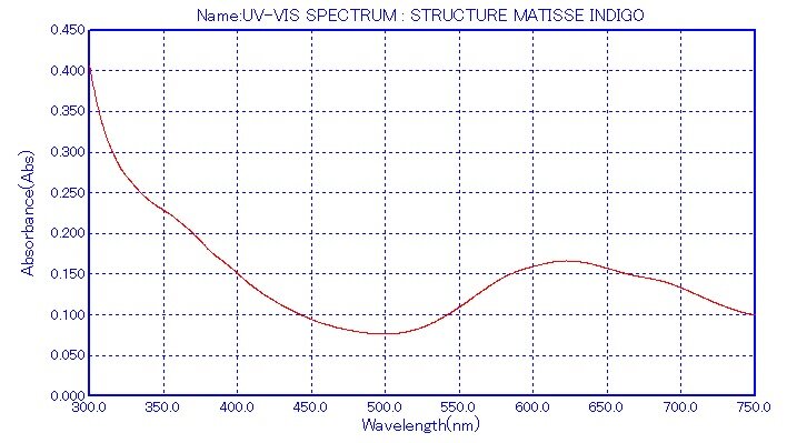
Matisse Indigo, labelled PB60 or Indanthrone Blue, poses a slight paradox as it is officially described as an anthraquinone rather than a true indigo. Despite this nuance, it stands out as a vat pigment renowned for exceptional lightfastness, establishing itself as one of the most enduring organic pigments for artists. Notably, even in subtle tints, its colour remains unwavering, presenting a dependable option for creative endeavours.
Unveiling a Warm Blue Palette
In the realm of deep dark blues, Matisse Indigo emerges as a warm counterpart to its cooler relative, Phthalo Blue. While Phthalo Blue leans towards greenish hues, Matisse Indigo offers a reddish warmth. This unique characteristic provides artists with the unprecedented opportunity to choose between warm and cool versions of a profoundly dark and lightfast blue, marking a historic milestone in artistic expression.
Resolving the Indigo Predicament
Contrary to the challenges faced by natural indigo, notorious for rapid fading, Matisse Indigo provides a lasting solution. Historical watercolour landscapes, tinted pinkish or ochre due to the fading of natural indigo, stand testament to the limitations of the past. If artists of yesteryears had access to Matisse Indigo, their skies would retain the original blue brilliance, defying the relentless hands of time.
Synergy with Ultramarine Blue
The warmth of Matisse Indigo seamlessly complements Ultramarine Blue. The deep tones of Matisse Indigo seamlessly merge with Ultramarine, allowing a gradual transition into shadows, approaching the richness of black. Introducing Transparent Venetian Red to this mix creates a blackish blue shade for the deepest shadows, ensuring a nuanced tonal shift without compromising the inherent character of the blue.
Vibrant Violets and Beyond
Matisse Indigo, akin to Ultramarine Blue, excels in crafting violets, offering deeper, darker, and more intense results. Depending on the chosen red partner, the spectrum ranges from regal purples to profoundly dark violets. Matisse Rose Madder lends itself to reddish purples, while Magenta Quin Violet excels in true violet hues, boasting exquisite magenta undertones. These colour mixtures, when lightened with white, reveal clean and beautiful pastel tints, surpassing the lightfastness of Dioxazine Purple.
Unexpected Allure with Metallic Mixtures
In the realm of experimentation, blending Matisse Indigo with metallic colours yields fascinating treasures. The combination with Metallic Copper produces a captivating bronzing effect, reminiscent of iridescent bird feathers. In imaginative artworks, especially abstracts, this mixture creates distinctive and beautiful hues, offering a realm of possibilities beyond conventional colour application.
Versatility in Green Creation
Matisse Indigo emerges as an excellent choice for crafting greens, particularly when paired with Matisse Emerald. Together, they produce a transparent dark bottle green, ideal for depicting dark green bottles common in still life paintings. Venturing into natural landscapes, Matisse Indigo, when mixed with Unbleached Titanium, captures the greenish greys found in eucalyptus leaves. Similarly, a blend with Raw Sienna achieves a dark greenish gray, perfect for shadowing on those same leaves.
From Ancient Egypt to Modern Mastery
Reflecting on the historical use of natural indigo from ancient Egypt to the late 18th century, artists valued the essence of a very dark blue on their palettes, despite its known tendency to fade. Today, the PB60 pigment in Matisse Indigo offers a contemporary solution. While it may be slightly more expensive, its permanence, captivating dark blue colour, and versatility in mixing blues, violets, and greens justify every investment for artists seeking excellence in their creations.
Safety Data Sheet for Matisse Indigo (SDS)
To view or download a copy of Matisse Indigo
CLICK HERE
* (271kb)
*The above link will open an external Dropbox window

To install this Web App in your iPhone/iPad press ![]() and then Add to Home Screen.
and then Add to Home Screen.
