Matisse Emerald | Matisse acrylic paint
Chemical Description: Chlorinated and brominated Phthalocyanine
Pigment Numbers: PG36
Lightfastness Rating: ASTM I
Pigment Opacity: Transparent
Paint Opacity: Transparent
Series 3
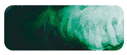
Matisse Emerald | Matisse acrylic paint
This superb green has many good qualities, such as very high permanence and it is non-toxic. It is descended from a color, however, that had a beautiful hue but was so poisonous it was used as an insecticide. For centuries the only bright green pigments where copper compounds such as malachite, verdigris, and copper resinate. All had their problems. Malachite wasn’t bright enough, and verdigris and copper resinate had a tendency to turn brown, especially in proximity to Ultramarine Blue or Vermilion. They were also poisonous. When Scheele’s green, also known as Swedish Green, was developed in 1775 it quickly replaced the older colors. It was still sensitive to Ultramarine Blue and Vermilion but was generally more permanent than the older colors It was made of copper and arsenic and it wasn’t realized at the timer just how dangerous that was and it was widely used as a colorant in textiles and in wallpaper designs because the new bright green became very fashionable.
There followed decades of children falling mysteriously ill in nurseries with Swedish green wallpaper, and women becoming sick from wearing the newly fashionable bright green party dresses. When Napoleon died it was thought to be due to cancer but recent testing of his hair samples show dangerously high levels of arsenic and it is speculated that the wallpaper in his rooms on St Helena which were recorded as being a bright green color may have poisoned him. Attempts to improve on Scheele’s green lead to the development of emerald green in 1814. In the new process arsenic was still used but vinegar was also used so that it became copper aceto-arsenite. This proved to be just as poisonous as Scheeele’s green, still sensitive to Ultramarine Blue and Vermilion, still incredibly poisonous, but was more permanent and had a glorious color that resembled emeralds.
It was not replaced until Viridian was developed in 1859. While it is known that Van Gogh did use Viridian on occasion, his favorite green color was the older emerald green. This became a great concern when his mental health deteriorated in the last year of his life. When in the asylum he was caught eating paint directly from the tubes which lead to him being denied his paint materials for some time. It is not recorded which colors he was swallowing but it cannot have been emerald green otherwise he might have died at that point. Emerald green was also the favorite green used by Cezanne and Monet. It has been speculated that the use of the pigment may have contributed to Van Gogh’s mental problems and may be the cause of Monet’s blindness.
Emerald Green, under its other name of “Paris Green” was a common insecticide until it was banned in the mid 20th century. It has been used to kill rats in Paris sewers and was sprayed by air in Italy during World War II to control malaria as well as an insecticide to control aphids on fruit trees in the early 20th century.
Emerald green was well liked by artists despite its dangers because of the beautiful deep green which was more yellowish than viridian and proved to be a more useful pigment on the palette. Matisse Emerald has a similar yellowish dark green color to the emerald green that Vincent Van Gogh, Cezanne, and Monet loved but is made from the yellow shade of phthalocyanine green, which, despite its chemical sounding name is perfectly safe to use and is much more permanent than the older color was. It is able to be freely mixed with all colors on the palette and is virtually a perfect pigment in all practical ways. Despite some romantic yearnings for the colors that the old masters used by some people, we are fortunate that many of their colors have been replaced with modern equivalents that are so much better.
Matisse Emerald is made from the yellow shade of Phthalocyanine pigment. When Phthalo Blue is made in the presence of Chlorine the green pigment is made. When bromine is added to the mixture this delightful yellow shade results. While the regular Phthalo Green is best for making blacks and blue greens, this yellow shade is generally better for mixing the sorts of greens the artist needs most often. The yellow shade of phthalocyanine is not as strong as the blue shade and that makes the color easier for the artist to use because it does not dominate mixtures like the blue shade does.
The beauty of this pigment reveals itself in the variety of beautiful colors that can be made with the color. Light pastel greens are made with Naples Yellow Light. These are the sorts of apple green colors that was a popular interior house color in the mid 20th century. Variations on these pastel colors is found in mixtures with Australian Blue Gum or Ash Pink. A brighter grass green is made with Yellow Deep and a useful olive green is made by mixing with Cadmium Orange. Transparent Yellow Oxide gives richer forest green with a lovely yellow green undertone. For sheer beauty of color, however, it is difficult to go past the mixture of Cobalt Teal and Matisse Emerald. They make turquoise greens that look like colors in a gemstone. Matisse Emerald is a color with a treasure chest full of beautiful colors just waiting to be mixed.
Safety Data Sheet for Matisse Emerald (SDS)
To view or download a copy of Matisse Emerald SDS, please CLICK HERE * (271kb)
*The above link will open an external Dropbox window

To install this Web App in your iPhone/iPad press ![]() and then Add to Home Screen.
and then Add to Home Screen.
