Magenta Light | Matisse acrylic paint
Chemical Description: Blend Arylide yellow, Naphthol red & Titanium dioxide
Pigment Numbers: PY74 PR122 PW6
Lightfastness Rating: BWS8
Pigment Opacity: Opaque
Paint Opacity: Opaque
Series 2
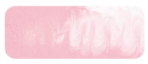
Magenta Light | Matisse acrylic paint
Permanence and History
Matisse Magenta Light stands as a blend of highly permanent pigments, individually tested and classified as ASTM I. While the colour itself awaits ASTM testing, the proven endurance of its components ensures reliability. This hue, often labelled an attractive blush pink, transcends its aesthetic appeal, finding versatile applications beyond the realms of fashion.
Scientific Painting Ideas: A Glimpse into the Past
In the early 20th century, scientific painting ideas gained traction, particularly in the United States. Artists like George Bellows and Robert Henri, associated with Henri’s art school, adopted the Maratta colour system. This system, based on primary colours and represented by numbers and letters on paint tubes, aimed for mathematical colour harmony. However, its complex rules and mathematical rigidity made it less appealing to artists, causing its eventual decline.
Scientific Painting Systems: A Rebirth in Acrylics
The concept of scientific painting systems experienced a resurgence with the advent of acrylics in the 1960s and 70s. The idea involved organizing colours logically on the wheel, with manufacturers blending tints akin to pre-made pastels. Despite the logical approach, this idea didn't dominate the art world. Artists, guided more by emotions and practical experience, choose colours not based on mathematical precision but on personal connection and utility. Matisse's colour chart, reflecting emotional and practical considerations, stands as a testament to this approach.
Magenta Quin Violet and Magenta Light: Survivors of Change
Two colours, Magenta Quin Violet and Magenta Light, endured from earlier scientific ideas. Magenta Quin Violet's importance is clear, providing a spectrum magenta crucial on the palette. Magenta Light, however, is less apparent initially. Artists appreciate it as an off-white substitute, offering a gentler lightening effect compared to pure white. Its true brilliance lies in serving as a base for creating a spectrum of colours, from lavender to soft cornflower blues, reminiscent of nature's hues.
Emotion in Colour: Vincent Van Gogh's Influence
Magenta Light's significance extends beyond its technical utility. In the last months of Vincent Van Gogh's life, he explored the emotional contrasts of mauves, violets, and golden ochres. Paintings like "Landscape At Auvers In The Rain" reveal the emotional depth conveyed through mauve colours. The connection between emotion and colour echoes our shared humanity with Vincent. In the subtlety of a paint tube, emotion intertwines with our artistic expression, creating a bridge to the vibrant world of Van Gogh's emotions on canvas.
Safety Data Sheet for Matisse Magenta Light (SDS)
To view or download a copy of Magenta Light SDS, please CLICK HERE * (271kb)
*The above link will open an external Dropbox window

To install this Web App in your iPhone/iPad press ![]() and then Add to Home Screen.
and then Add to Home Screen.
