Burgundy | Matisse acrylic paint
Chemical Description: Blend Quinacridone, Naphthol carbamide & Carbon black
Pigment Numbers: PR122 PR170 PBk7
Lightfastness Rating: ASTM II
Pigment Opacity: Transparent
Paint Opacity: Semi-Transparent
Series 2
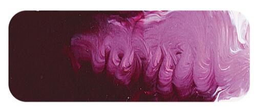
Burgundy | Matisse acrylic paint
The Antiquity Connection: From Tyrian Purple to Burgundy
Burgundy, a deep reddish-purple hue, echoes the shades of Tyrian purple used in ancient times. Tyrian purple, derived from sea snails, held an extraordinary value, equivalent to the weight of silver. Worn exclusively by Roman emperors, it was forbidden for the common people. Its origins trace back to the ancient Phoenicians or the Minoans, and its production ceased in the 12th century AD.
Modern Affordability: The Composition of Burgundy
Thankfully, Burgundy is far more accessible than its ancient counterpart. Comprising quinacridone red, naphthol red, and black, this colour blend can be recreated on the palette. One may wonder why purchase it pre-mixed in a tube? While its visual allure may explain the initial attraction, the recurring appeal suggests a practical utility in the artist's studio.
Utility in the Studio: Beyond Aesthetics
In the realm of the artist's studio, certain colours prove consistently useful. Burgundy, with its earthy dark red character, falls into this category. Ideal for creating muted earth tones, it finds applications in human skin, rocks, trees, and even shadows in various artworks. The convenience of having it pre-mixed saves time and ensures a reliable and consistent result, explaining its continued popularity among artists.
Unexpected Versatility: Playing Well with Others
Beyond its traditional associations, Burgundy surprises with its versatility. Combining it with Australian Ghost Gum produces dusky, gorgeous colours with a beautiful pinkish undertone. These hues are perfect for capturing the essence of gum tree bark or the light in rural summer afternoons. Mixing Burgundy with Ultramarine Blue unveils inky violet shadows, adding dark mysteries and hidden depths to artworks.
Harmonising with Nature: Blues and Beyond
The interplay of Burgundy with Cerulean Blue yields soft and gentle blues, reminiscent of wildflowers and distant hills. These hues also mirror the softening of the sky as the sun sets, transitioning from the intense blue of daytime to the subtle hues of night. In this harmonious collaboration, Burgundy proves to be a colour not confined to traditional expectations but one that explores the rich spectrum of artistic possibilities.
Safety Data Sheet for Matisse Burgundy (SDS)
To view or download a copy of Burgundy SDS, please CLICK HERE * (271kb)
*The above link will open an external Dropbox window

To install this Web App in your iPhone/iPad press ![]() and then Add to Home Screen.
and then Add to Home Screen.
