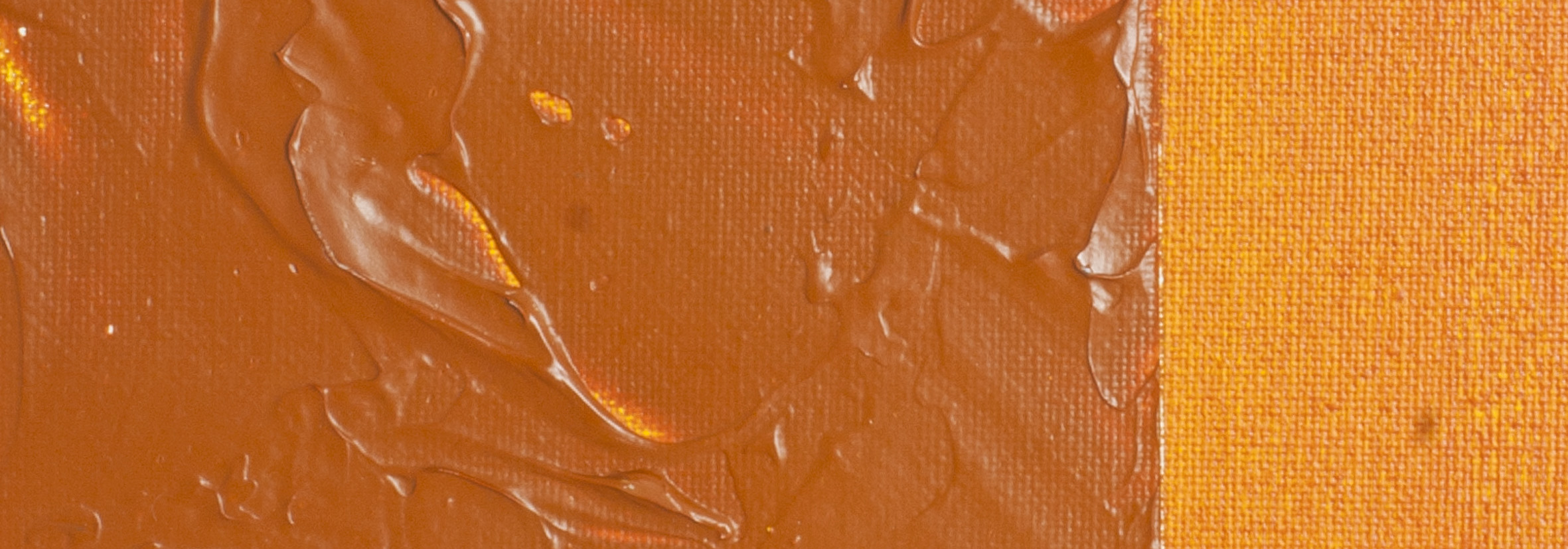
Quinacridone Burnt Orange | Matisse Acrylic Paint
Pigment Number: PR206
Pigment Opacity: Semi-transparent
Paint Opacity: Semi-transparent
Series 6

Quinacridone Burnt Orange | Matisse Acrylic Paint
Quinacridone Burnt Orange, known as PR206 in the art world, boasts a striking earthy maroon hue in its densest form. As you dilute it, it reveals a vivid red undertone. Renowned for its capacity to produce effective shadows, particularly when blended with blues or yellows, it's a favourite for crafting deeper flesh tones in portraits. When mixed with phthalo blue, it creates a diverse palette of browns, turquoise and greens. Artists favour this pigment for its versatility, finding it particularly apt for landscapes and seascapes, where it harmonises seamlessly with natural colours.
A Glimpse into Its History
The Quinacridone compound's journey began in 1896. However, it wasn't until 1955 that its potential as a pigment was realised. By 1958, Quinacridone pigments hit the market following the refinement of a commercially viable synthesis process. Artists, especially those from the abstract expressionist movement, quickly adopted these pigments, drawn to their robust colour and transparency.
Durability and Flexibility
Quinacridone pigments are celebrated for their stability, withstanding light, heat, and solvents. This resilience makes them ideal for various uses, including cosmetics, automotive, and plastic industries.
Mixing Magic and Medium Compatibility
Quinacridone Burnt Orange pairs beautifully with a variety of colours. Blending with Ultramarine Blue or yellow oxide creates deep reds and oranges. Introduce white to these mixes, and you'll find delightful peachy shades. This versatility is a boon for artists experimenting with colour mixing.
The Quinacridone Family
Beyond Burnt Orange, the Quinacridone family boasts a range of colours, including the dazzling Quinacridone Magenta (PR122), a hit among botanical artists. This family's signature is its vibrant, jewel-toned hues, offering artists a rich palette for creative expression.
Beyond a Hue: The Depth and Versatility of PR206
Quinacridone Burnt Orange (PR206) is not just a pigment; it's a modern interpretation of traditional colours like Brown Madder. Its semi-transparent nature and rich, earthy tones offer artists unparalleled depth and vibrancy. This pigment's unique blend of warmth and intensity makes it an essential addition to any artist's palette, whether for use in landscapes, portraits, or abstract art.
Safety Data Sheet for Matisse Quinacridone Burnt Orange (SDS)
To view or download a copy of Quinacridone Burnt Orange SDS, please CLICK HERE * (271kb)
*The above link will open an external Dropbox window
Quinacridone Burnt Orange is available in Matisse Structure

To install this Web App in your iPhone/iPad press ![]() and then Add to Home Screen.
and then Add to Home Screen.
