Primary Blue | Matisse Acrylic Paint
Chemical Description: Phthalocyanine blue, trace Titanium dioxide
Pigment Number: PB15.3 PW6
Lightfastness Rating: ASTM I
Pigment Opacity: Semi-transparent
Paint Opacity: Semi-transparent
Series 2
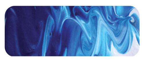
Primary Blue | Matisse Acrylic Paint
The Role of Primary Blue in Colour Mixing
Primary Blue emerges as a captivating element in an artist's toolkit, bringing unexpected versatility. While Primary Yellow and Primary Red find their places in conventional colour mixing scenarios, Primary Blue stands out as a unique colour valued across various techniques. Its significance as one of the three basic primary colours warrants exploration, particularly in its pivotal role in the 3, 4, and 5 colour mixing methods.
Central Spectrum Hue: A Unique Advantage
In understanding its role, it's crucial to recognize that not all pigments within the yellow, red, or blue ranges are equally adept at mixing colours. A colour precisely centered in the spectrum hue, such as Primary Blue, holds a unique position. Unlike Ultramarine Blue, which tends towards a reddish tone, Primary Blue sits at the heart of the spectrum, facilitating the creation of a broad spectrum of colours. This centrality enables it to produce both vibrant greens and violets, forming the basis of the 4-colour printing process, a methodology echoed in acrylic paintings.
Printing Ink Inspiration: The Birth of Cyan
Drawing inspiration from printing inks, Matisse crafts Primary Blue without extenders. In contrast to traditional cyan inks, Matisse's approach involves blending the correct shade of Phthalo Blue pigment with white, yielding a lovely cyan-like colour. This deviation from extenders ensures the colour's usability as paint, maintaining its richness and vibrancy.
Powerful Colour Mixing Potentials
Primary Blue's potential unfolds when mixed with its primary counterparts. The fusion of Primary Blue and Primary Yellow yields a striking green, while the combination of Primary Blue and Primary Red produces a clean and beautiful violet. These three primaries, along with black and white, form a powerful palette, simplifying the complexities of colour mixing. Teachers find this approach invaluable in conveying fundamental colour theories, demonstrating the incredible possibilities achievable with a minimalist palette.
Beyond Primary Combinations: A Versatile Landscape Palette
Primary Blue's brilliance extends beyond primary combinations. Landscape artists discover its prowess when blended with Australian Sky Blue, creating stunning sky colours. From tropical seas to the Great Barrier Reef and the Caribbean, Primary Blue, when mixed with Cobalt Teal or Aqua Green Light, replicates the exquisite turquoise shades found in nature. The potential further unfolds when mixed with earth colours, producing an array of greens from bottle green to earthy olives, adding a layer of surprise and experimentation to the artistic process.
Conclusion: Primary Blue's Palette Symphony
Primary Blue, with its surprising and rewarding nature, emerges as a key player in an artist's palette. Whether harmonizing with primary counterparts or dancing with earth colours, its versatility and ability to evoke gorgeous hues make it an essential and delightful component for every artist's exploration.
Safety Data Sheet for Matisse Primary Blue (SDS)
To view or download a copy of Primary Blue SDS, please CLICK HERE * (271kb)
*The above link will open an external Dropbox window

To install this Web App in your iPhone/iPad press ![]() and then Add to Home Screen.
and then Add to Home Screen.
