Permanent Light Violet | Matisse Acrylic Paint
Chemical Description: Blend Titanium doxide & Carbazole dioxazine
Pigment Number: PW6 PV23
Lightfastness Rating: ASTM II
Pigment Opacity: Opaque
Paint Opacity: Opaque
Series 2
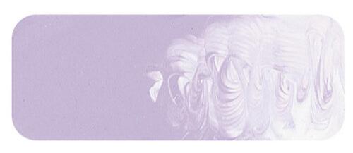
Permanent Light Violet | Matisse Acrylic Paint
Introduction to Permanent Light Violet
Permanent Light Violet, a delicate pastel shade, might appear inconspicuous initially, yet its enduring popularity among artists attests to its essential role. Widely embraced by graphic artists for large-scale poster-style works, this colour extends beyond its apparent applications. Its versatility unfolds as it steps into the realm of off-whites—whites subtly tinted with colour. Matisse, recognizing the significance of off-whites, provides various hues, with Permanent Light Violet serving as an ideal option for lightening violet tones.
Off-Whites: A Valuable Palette Asset
The term "off-white" implies whites with a hint of added colour, proving invaluable for artists. While pure Titanium White may lighten colours, its potential harshness risks draining vibrancy. Opting for lighter colours, like Permanent Light Violet, ensures a gentler touch during the lightening process. Reserved use of pure Titanium White is recommended solely for the very lightest tints.
Creating a Palette of Mauves and Lavenders
Permanent Light Violet emerges as a foundational colour for crafting an array of pale mauves, lavenders, and light violet hues. These subtle tones find abundant expression in landscapes and, in more imaginative works, evoke an ethereal sense of otherworldliness. Romantic period artists, notably Turner, harnessed the emotional depth of violet, mauve, and blue contrasts with gold, yellow, and red to create atmospheric scenes. Violet, with its spectrum ranging from sensual mauve to spiritual violet and rich imperious purple, instills diverse emotions, making it ideal for the most dreamlike subjects.
Emotional Depth in Traditional and Imaginative Landscapes
Permanent Light Violet's unique ability to infuse traditional landscapes with emotion is noteworthy. Mauve introduces the warmth of summer, evoking vast open spaces extending to distant hills and mountains. Experimentation on the lighter side of the palette becomes a tempting endeavour. When mixed with Ultramarine Blue, it produces beautiful soft blueish mauves. Combining it with Dioxazine or Burgundy yields deeper purple mauves, while partnering with Venetian Red creates earthy mauves harmonizing with earth tones. The colour becomes a playground for exploring the lighter nuances of artistic expression.
Safety Data Sheet for Matisse Permanent Light Violet (SDS)
To view or download a copy of Permanent Light Violet SDS, please CLICK HERE * (271kb)
*The above link will open an external Dropbox window

To install this Web App in your iPhone/iPad press ![]() and then Add to Home Screen.
and then Add to Home Screen.
