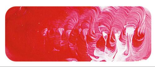
Naphthol Crimson | Matisse Acrylic Paint
Chemical Description: Naphthol carbide
Pigment Number: PR170
Lightfastness Rating: ASTM II
Pigment Opacity: Transparent
Paint Opacity: Semi-transparent
Series 3

Naphthol Crimson | Matisse Acrylic Paint
Historical Evolution: Para Red to PR170
Naphthol pigments have roots dating back to the 1880s, with the inaugural pigment known as para red. In the 20th century, superior alternatives like PR170, still belonging to the naphthol family but showcasing enhanced permanence, overshadowed its predecessor. These pigments derive their name from being phenols ultimately sourced from naphthalene, also fittingly described as azo pigments. Before the advent of quinacridones, naphthols held sway as the most lightfast reds, finding applications in automotive coatings for decades. Their enduring popularity persists in the printing inks industry, especially in high-quality printing scenarios.
Permanence Dynamics: Ink Industry vs. Automotive Use
In the realm of inks, naphthol pigments boast excellent permanence. However, in the automotive industry, they bear a reputation for fair lightfastness. Essentially, the colour may retain its vibrancy for a few years, but it tends to gradually fade over the vehicle's lifespan. In artistic applications, full-strength usage ensures excellent lightfastness, although some fading might occur in pale tints. Despite this, Naphthol Crimson remains favoured for valid reasons. Firstly, it offers a cost advantage over comparable pigments. Not every artwork demands millennium-long endurance, making the additional cost of alternatives unjustifiable. Secondly, it presents an exquisite crimson hue, powerful, and possessing greater coverage than Quinacridone Red. The strength to volume ratio makes it a cherished, value-for-money colour among artists.
Versatility Unleashed: Naphthol Crimson in Artistic Expressions
Beyond its prowess as a pure red in graphic arts, Naphthol Crimson unfolds its versatility. When blended with Ultramarine Blue, it yields captivating violets, with nuances varying by experimenting with different blues, such as Cobalt Blue. For softer, more muted violets and mauves, a rendezvous with Cerulean Blue is the artist's choice. Mixing it with white unveils cool pinks, while partnering with Burnt Umber produces a warm burgundy hue. Naphthol Crimson emerges as the artist's versatile companion, offering a spectrum of possibilities to bring creative visions to life.
Safety Data Sheet for Matisse Naphthol Crimson (SDS)
To view or download a copy of Naphthol Crimson SDS, please CLICK HERE * (271kb)
*The above link will open an external Dropbox window

To install this Web App in your iPhone/iPad press ![]() and then Add to Home Screen.
and then Add to Home Screen.

