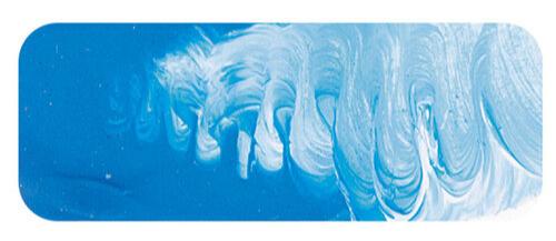
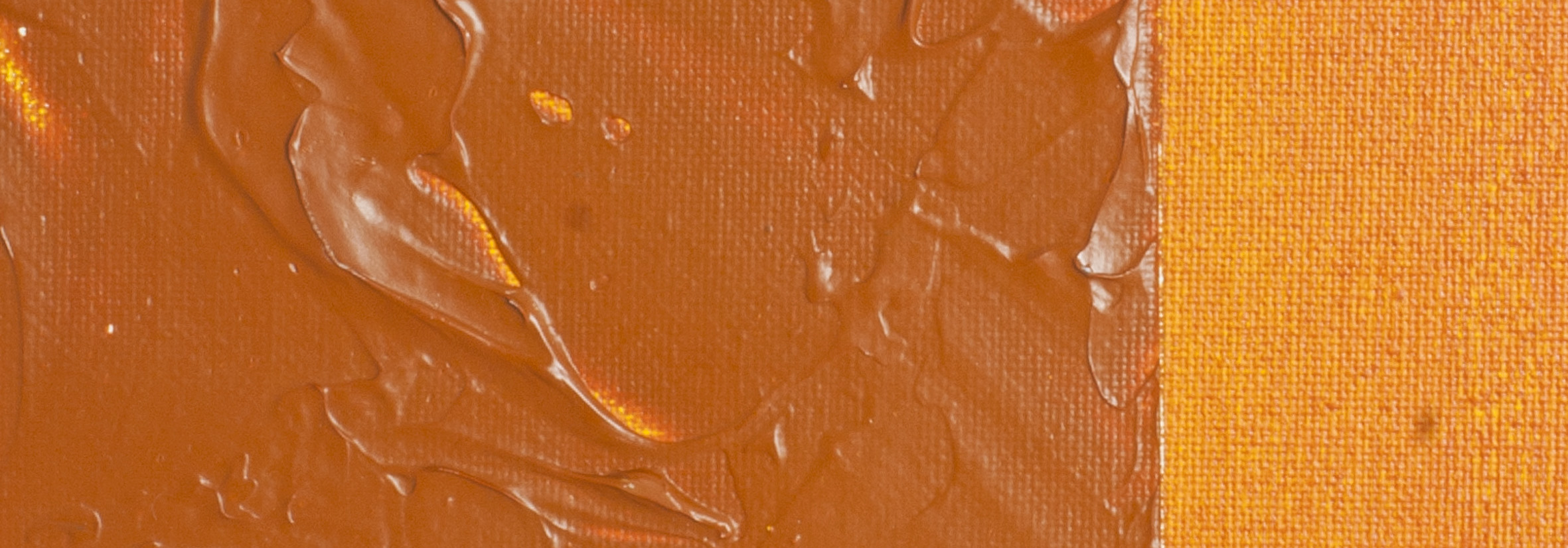
Cerulean Blue | Matisse acrylic paint
化学物質の概要: コバルト、アルミニウム、クロムの酸化物
Pigment Numbers: PB36
Lightfastness Rating: ASTM I
顔料の不透明度: 半透明
Paint Opacity: Semi-Transparent
シリーズ4

Cerulean Blue | Matisse acrylic paint
Etymology and Origins
Cerulean, a term derived from Latin, translates to "sky blue." Interestingly, the phrase "Cerulean Blue" essentially means "sky blue blue," showcasing the quirks of language. Coined in 1860, it labelled a pigment developed 55 years earlier, overlooked by chemists until its significance to artists became apparent. This pigment, a blend of cobalt and tin, boasts remarkable permanence, ranking among the top pigments for light resistance alongside Titanium White and Chromium Green Oxide. Matisse Cerulean Blue, a chromium version, continues this legacy.
Chromium: A Chromatic Journey
Chromium, a captivating element, stands out for its unique colour properties. Unlike most metals, which present in silvery gray or colourless compounds, chromium shares this distinction with copper. While copper found early use for its colour, chromium's chromatic potential surfaced in the 18th century. Initially employed in China for hardening arrow tips, its natural colouring graced rubies. However, its full understanding and application awaited the Industrial Revolution. Utilized as a red colour in 1760, often mistaken for a lead compound, chromium's isolation and alloy properties emerged in the early 20th century, contributing to stainless steel and shiny chrome surfaces.
Cerulean Blue in Artistic Exploration
Cerulean Blue finds a kindred spirit in Azurite, an ancient pigment with lesser permanence. While it may appear a tad dark from the tube for painting skies, blending it with Australian Sky Blue achieves an ideal hue. Sky colours, ever-changing with seasons, time of day, and weather, elude precise formulas. Yet, a blend of Cerulean Blue, Australian Sky Blue, and hints of Ultramarine Blue or Cobalt Blue captures the essence of clear skies, especially during midday.
Green Landscapes and Beyond
In the artistic realm, landscapes beckon an array of greens, skilfully crafted with Cerulean Blue. Pairing it with earth colours like Transparent Yellow Oxide yields greens of extraordinary permanence, a treasure enviable even to the old masters. Yet, Cerulean Blue's artistic prowess extends beyond greens. Mix it with Cadmium Orange for smoky mid-greys or Venetian Red for sensuous, deep mauves. Turquoise emerges as another facet of this versatile colour. Blending with Cobalt Teal or Aqua Green Light produces light or mid-turquoise shades, while pairing with Phthalocyanine Green or Matisse Emerald crafts darker turquoise hues. Cerulean Blue, truly a boon for artists, continues to unfold its chromatic blessings.
Safety Data Sheet for Matisse Cerulean Blue (SDS)
To view or download a copy of Cerulean Blue SDS, please CLICK HERE * (271kb)
*The above link will open an external Dropbox window

To install this Web App in your iPhone/iPad press ![]() and then Add to Home Screen.
and then Add to Home Screen.

