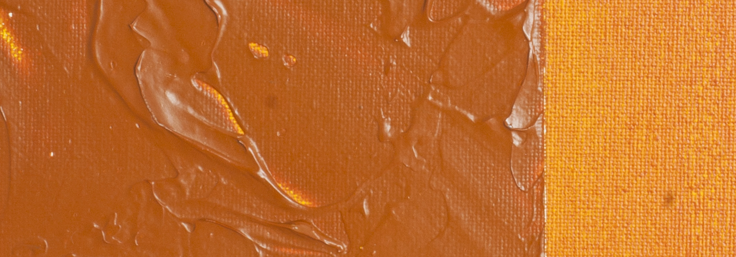
オーストラリアン・シェンナ | マティス・アクリル絵具
化学物質の概要:ジアリライドイエローと酸化鉄の混合
顔料番号: PY83 PR101 PY42
耐光性評価 : ASTM I
顔料の不透明度: 半透明
絵具の不透明度 : 透明
シリーズ3
Australian Sienna | Matisse acrylic paint
Chromatic Challenges in Inland Australia
Artists in inland Australia faced a challenge for years. Paints crafted by northern hemisphere manufacturers catered to the softer light of Europe, not the intense luminosity of exotic and warmer regions like North Africa, the American Midwest, and much of Australia. In these landscapes, where the sky gleams pure cobalt and the earth radiates vibrant reds, oranges, and yellows, a particular need arose. While transparent yellow, red, and umber oxides covered many colours, a transparent sienna was missing to capture hues akin to the bright orange rocks of Kakadu. Responding to artists' needs, Matisse's colour specialists formulated a distinctive blend—Australian Sienna, featuring an earthy orange mass tone with a golden undertone, ideal for arid regions.
Richly Coloured Landscapes Across Australia
The intense saturation of colour isn't exclusive to Kakadu; Australia boasts richly coloured landscapes from Port Augusta to Cape York, Kalgoorlie to Collaroy. These vibrant hues extend globally, gracing locations like the Grand Canyon, the Sahara, and Petra. Australian Sienna's colour richness harmonizes seamlessly with these diverse landscapes, offering artists a versatile palette for capturing the vibrancy of such locales.
Beyond Gold Ochre: The Transparency Advantage
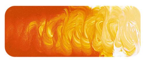
While resembling a gold ochre in many aspects, Australian Sienna surpasses traditional gold ochre pigments in transparency and the resulting golden undertone. Undertone, the colour revealed in a thin paint film, often differs significantly from the mass tone. Transparency enhances this effect, making Australian Sienna stand out with its distinctive undertone.
Versatility in Colour Mixing
The transparency of Australian Sienna adds delight to colour mixing, especially in creating olive greens that radiate with richness. Combining it with Matisse Scarlet or Primary Red produces the deep reds reminiscent of Kakadu or the Arches National Park. Adding a hint of Australian Ghost Gum to the mix conjures the delicate pinks found in Petra's stone. Despite its name linking it to Australia, this colour proves to be a versatile choice for global landscapes. Its distinct behavior in mixtures sets it apart from Raw Sienna, making both colours invaluable additions to an artist's paint box, each bringing its unique qualities to the canvas.
Safety Data Sheet for Matisse Australian Sienna (SDS)
To view or download a copy of Australian Sienna SDS, please CLICK HERE * (271kb)
*The above link will open an external Dropbox window

To install this Web App in your iPhone/iPad press ![]() and then Add to Home Screen.
and then Add to Home Screen.
