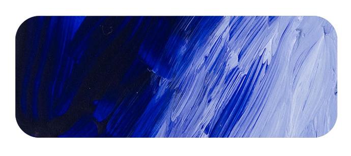
French Ultramarine Blue
Chemical Description: Sodium Alumisonulphosilicate
Pigment Number: PB29
Lightfastness Rating: ASTM I
Pigment Opacity: Transparent
Paint Opacity: Transparent
Series 3

Introducing Matisse's French Ultramarine - A Radiant Spectrum of History and Versatility
We are delighted to introduce you to our new French Ultramarine Acrylic colour, a warm and captivating addition to your artistic toolkit. This rich and versatile blue pigment offers many creative possibilities, and its remarkable history adds a unique depth to your artistic journey.
Warm Blues and Creative Depth:
French Ultramarine Acrylic falls into the category of warm blues, slightly more generous than the existing Matisse Ultramarine blue. Both blues are distinguished by their enchanting purple bias rather than the conventional green undertones in more excellent blues. Warm blues like French Ultramarine can draw elements forward in your artwork, infusing your compositions with depth and vitality. When you seek to create expressive and immersive paintings, the warmth of French Ultramarine becomes an invaluable asset.
A Crucial Palette Component:
It's essential to balance warm and cool blues in your artistic palette. When paired, they harmoniously blend to form a mid-blue, a versatile cornerstone for your colour-mixing endeavours. French Ultramarine complements its more relaxed counterparts, offering a broad spectrum of shades to explore.
Colour Alchemy with French Ultramarine:
This captivating hue exhibits its magic when mixed with other colours:
• Lustrous Purples: When combined with calm (rose or pink) reds, French Ultramarine effortlessly creates clear, luminous purples, enabling you to infuse your artwork with enchantment.
• Realistic Greens: Blend French Ultramarine with warm (orange) yellows to craft natural, realistic greens, perfect for depicting landscapes and botanical wonders.
• Vibrant Mid Greens: Mixing French Ultramarine with cool (greenish) yellows yields a range of mid-greens, capturing the vitality of foliage and natural scenes.
• Balanced Neutrals: The marriage of French Ultramarine with warm (orange) reds results in harmonious mid-neutralized purples, enhancing your compositions' overall balance and unity.
• Elegant Neutrals and Greys: Combine French Ultramarine with its opposite, orange, to produce nuanced neutrals and refined greys, allowing you to explore subtleties of tone and mood.
A Journey Through Time:
The history of French Ultramarine is a captivating tale that enriches the significance of pigment. The term "ultramarine" derives from Latin roots, "ultra" meaning beyond and "mare" signifying sea. It alludes to the semi-precious lapis lazuli from which the pigment was first extracted. This remarkable stone travelled the Silk Road from Afghanistan to Europe, introducing the vivid blue hue to the Western world. Early evidence of ultramarine's use can be traced back to the cave temples of Bamiyan in Afghanistan during the 6th and 7th centuries AD.
Lapis lazuli, a blend of lazurite, silicate, and pyrite, was used for decorative purposes in ancient Egypt and Sumer. However, the extraction of the blue pigment came much later in history. Ultramarine's presence is noted in Chinese, Indian, Anglo-Saxon, and Norman artworks, but its rarity and intensive extraction process rendered it exceptionally valuable—gram for gram, more precious than gold.
A Treasure Unveiled:
The laborious extraction process involved grinding the mined mineral and mixing it with resin, linseed oil, or wax. This mixture was then heated to form a dough-like consistency, followed by kneading and submersion in a lye solution. The resulting blue flakes were separated, dried, and ground into a fine blue powder pigment. To obtain higher grades, the process was repeated, extracting even finer pigments. Despite the arduous process, the quality of natural ultramarine was unmatched, free from impurities that could affect the paint's colour. It's a rarity, and labour-intensive production ensured its exorbitant price.
The Revolution of French Ultramarine:
Ultramarine remained a costly pigment until the advent of a synthetic version. In 1828, French chemist Jean-Baptiste Guimet succeeded in creating "French ultramarine." This synthetic variant was chemically identical to its precious natural counterpart. The development of synthetic ultramarine revolutionised its accessibility and affordability, making it available to a broader audience.
The Enduring Legacy:
Today, Ultramarine Blue is one of the artist's palette's most revered and versatile blues. Its journey from a precious gemstone to a readily available pigment is a testament to its enduring legacy. It graced Europe during the Italian Renaissance, adorning the works of artists who marvelled at its beauty and value. Over the centuries, the usage of Ultramarine Blue expanded as its cost decreased, eventually becoming a beloved staple in the artist's toolkit.
The Essence of Ultramarine Blue:
With its warmth and transparency, Ultramarine Blue serves as a workhorse blue for artists, finding its place in many applications. From capturing the vastness of the sky to crafting earthy olive greens when paired with Yellow Oxide, this pigment showcases its versatility. Whether you aim to create vibrant violets, soft leafy greens, or deep, elegant neutrals, Ultramarine Blue is your trusted companion.
A Vibrant Evolution:
The French Ultramarine Blue, often with a slight violet tinge, offers a brighter, more light-reflective quality compared to the original Ultramarine Blue and very much so to its natural counterpart. While both possess unique qualities, many modern artists gravitate towards the French Ultramarine because its slightly redder hue produces increased vividness and versatility.
French Ultramarine vs Ultramarine Blue
Navigating the Spectrum of Blues The choice between French Ultramarine and Ultramarine Blue is more than just a selection of hues; it's an artistic decision that defines the mood and character of your work. French Ultramarine, distinguished by its warmer, slightly redder undertone, offers a vibrant and expressive edge. This lively variation of blue is perfect for artists who seek to infuse their compositions with energy and brightness, making it a popular choice for modern, dynamic pieces. In contrast, Ultramarine Blue is the epitome of classical elegance. Its cooler, deeper tone is reminiscent of the serene twilight sky and the mysterious depths of the sea, making it ideal for creating artwork with a tranquil and contemplative atmosphere. Whether you lean towards the warmth and vivacity of French Ultramarine or the tranquil depths of Ultramarine Blue, each brings its unique flavour to the canvas, allowing you to explore different emotional landscapes and artistic expressions.
Ultramarine Blue is available in Matisse Structure

To install this Web App in your iPhone/iPad press ![]() and then Add to Home Screen.
and then Add to Home Screen.

