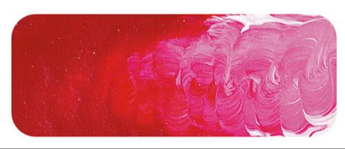
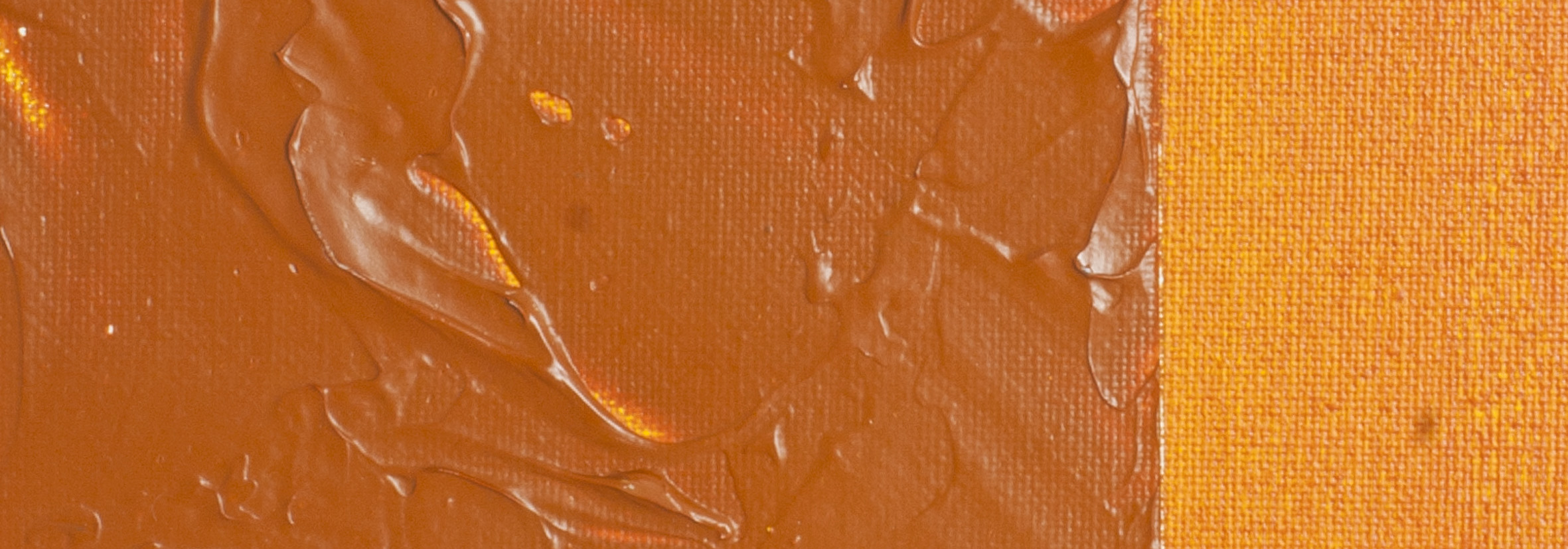
Brilliant Alizarin (Crimson)
| Matisse acrylic paint
Chemical Description: Blend Quinacridone & Naphthol carbamide
Pigment Numbers: PR122 PR170
Lightfastness Rating: ASTM II
Pigment Opacity: Transparent
Paint Opacity: Semi-Transparent
Series 3

Brilliant Alizarin (Crimson) | Matisse acrylic paint
Roots in History: Alizarin Crimson's Legacy
The precursor to Brilliant Alizarine, Alizarin Crimson, emerged in 1868, derived from the root of the madder plant. Madder, with a history dating back to ancient Egypt, was initially used to produce reddish colours on cloth using mordants. Despite suggestions of its use in the Renaissance for painting, confirmed examples point to Kermes insects, not madder, as the source of red lake pigments. The synthetic Alizarin, developed in 1804 by George Field, marked a significant milestone. Surprisingly, Perkins in England and Graeb and Liebermann in Germany independently discovered the synthetic Alizarin within a day of each other in the 19th century.
Industry and Permanence: The Alizarin Era
Initially believed to be very permanent, Alizarin Crimson became a significant industry. Its low cost and beautiful colour sustained its usage despite later revelations about its suboptimal permanence. In the 1930s, as more permanent pigments became available, Alizarin's deficiencies were exposed through ASTM testing, classifying it as unsuitable for artists' paints. In the 1950s, Matisse acrylics introduced Brilliant Alizarine (Crimson) as a vibrant alternative, avoiding the impermanence and slight dirtiness associated with Alizarin Crimson.
Brilliant Alizarine: A Modern Solution
Designed to fill the colour mixing role of Alizarin without its drawbacks, Brilliant Alizarine became an instant hit. While classified as ASTM II, meaning it may show some perceptible fading in very pale tints mixed with white over a long period, its durability remains acceptable for permanent painting. Matisse offers ASTM I alternatives, such as Rose Madder and Deep Rose Madder, but Brilliant Alizarine stands out as a cost-effective choice with stunning aesthetics.
Practical Significance of ASTM Ratings
ASTM I and ASTM II ratings signify durability, ensuring little or no change in colour in an 80 to 100 year timeframe, particularly indoors. While ASTM I remains reliable even in very pale tints, ASTM II may exhibit some perceptible fading in such mixtures. Brilliant Alizarine's affordability makes it an excellent option for budget-conscious artists, providing exceptional value for money without compromising on beauty.
Chromatic Splendour: The Gorgeous Hue
Brilliant Alizarine (Crimson) boasts an intense cool cherry red, captivating whether used in its pure form or appreciated for its clean red undertone. It’s true glory lies in its versatility as a mixing colour, perfectly suited for crafting mauves and warm violets reminiscent of Pre-Raphaelite paintings. When blended with Ultramarine, blues, browns, and white, it unveils a spectrum of violet possibilities, from lavender to dusky rose to rich burgundy. Additionally, mixing it with Phthalocyanine Green produces luminous and transparent dark charcoal colours, allowing artists to explore an array of hues by varying the green and red components.
Safety Data Sheet for Matisse Brilliant Alizarin Crimson (SDS)
To view or download a copy of Brilliant Alizarin Crimson SDS, please CLICK HERE * (271kb)
*The above link will open an external Dropbox window
Brilliant Alizarin Crimson is available in Matisse Structure, Matisse Flow, Matisse Fluid

To install this Web App in your iPhone/iPad press ![]() and then Add to Home Screen.
and then Add to Home Screen.

